People have asked me how I do my digital cartoon paintings so I'll attempt to explain it.
I'm sure there are many ways to do this but after years of trial and error this is the system I use.
First I draw a cartoon on paper. Then I scan it in and open it in Photoshop.
Once it's open, I up the resolution to 500 or 600dpi. A high resolution will make the final inking and painting crisper.
Before I start actually painting or shading any of the drawing I have to take some steps to prep the drawing to make it easy to paint. Basically I create a flat inked and colored drawing that has no shading yet. It looks like a 2d animation cel.
This takes a few steps and a lot of layers and folders.
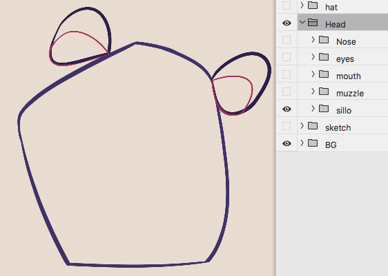
Usually I start by making a couple folders in the layer window, one for the head and one for the body.
For the purposes of this post I am just going to prep a head and a fairly simple one. I use the exact same procedure for the body when there is one.
1) Inking
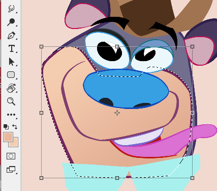
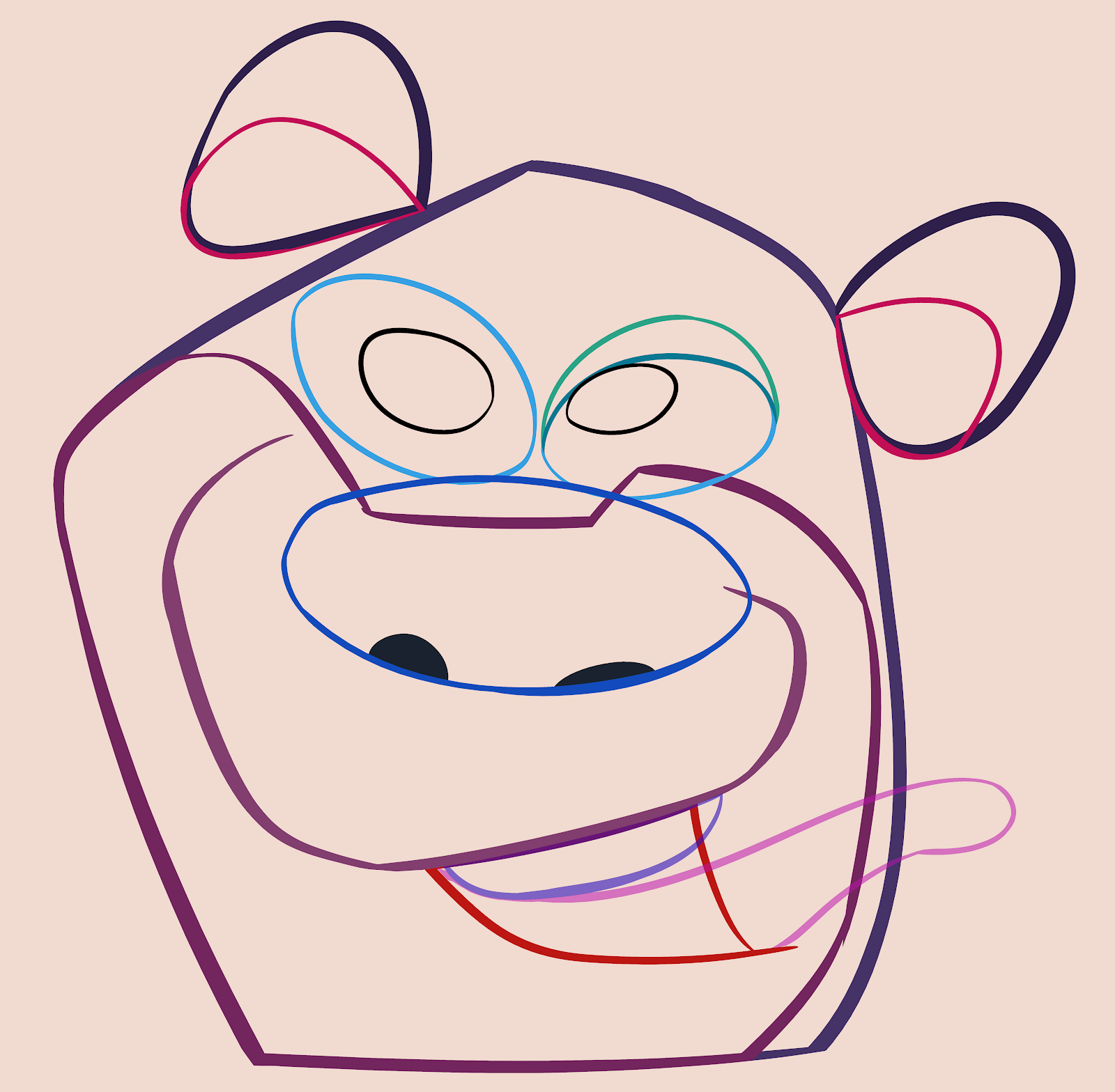
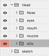
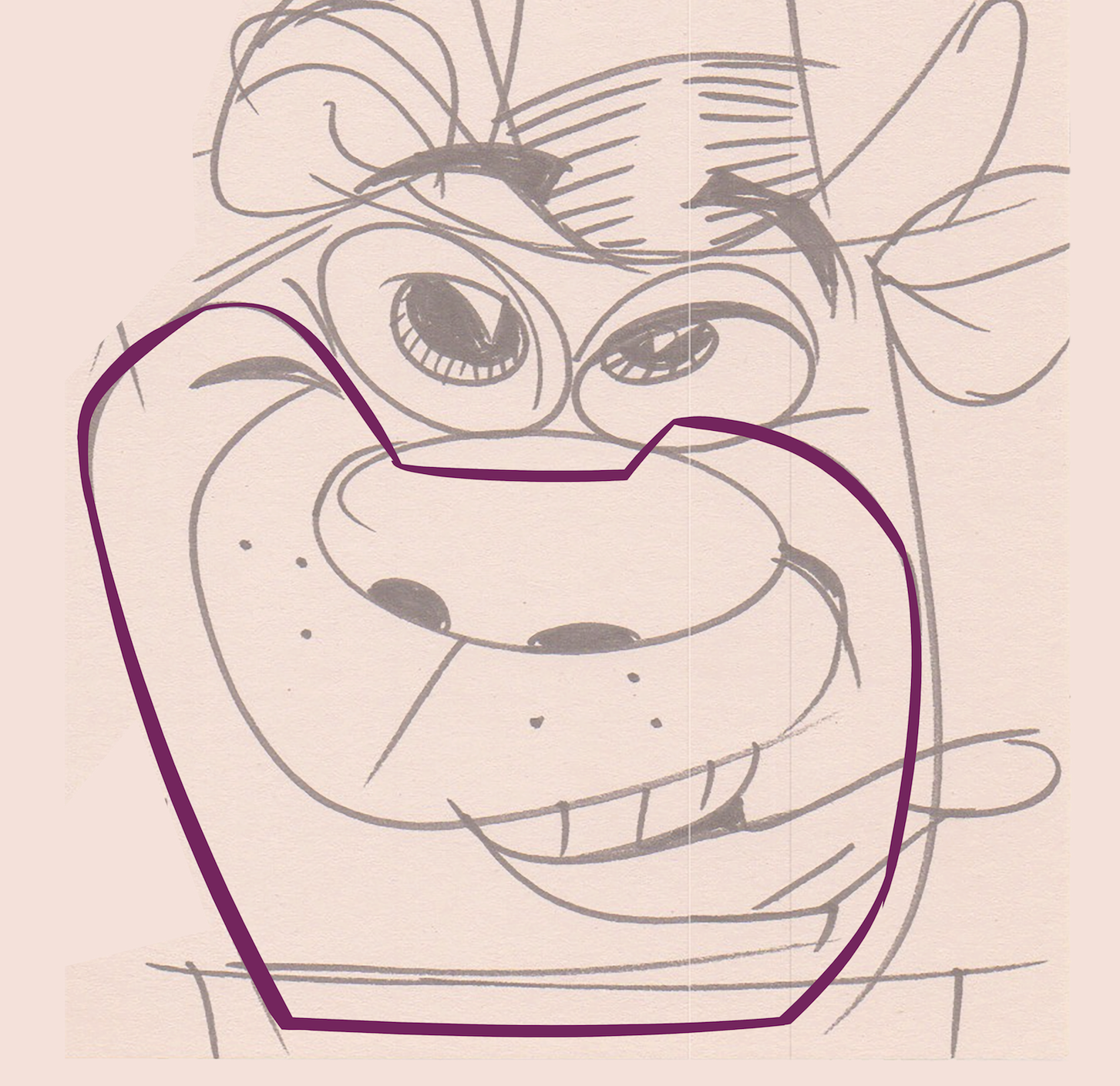
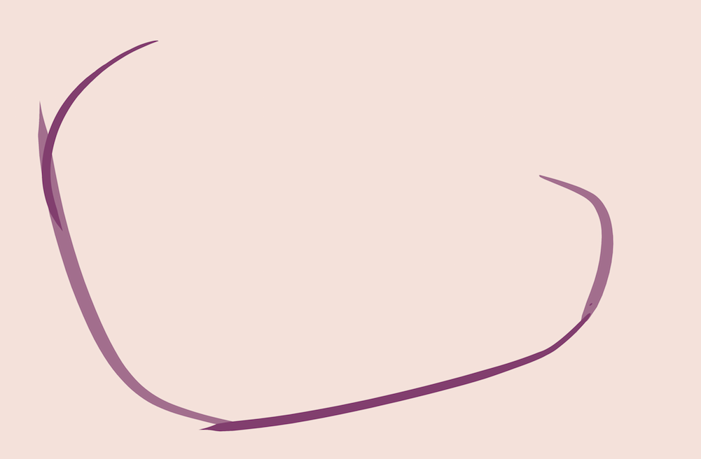
I do the biggest shape first which usually is the overall silhouette of the head. I make a folder and call it 'sillo' for short. I make a layer in the folder and call that 'sillo' as well.
For more details on how to ink cleanly see my new Patreon site.
Then I trace the head shape using one of Kyle's Ultimate brushes called 'Smooth Criminal'. It's a very good inking brush with no fuzzy edges.
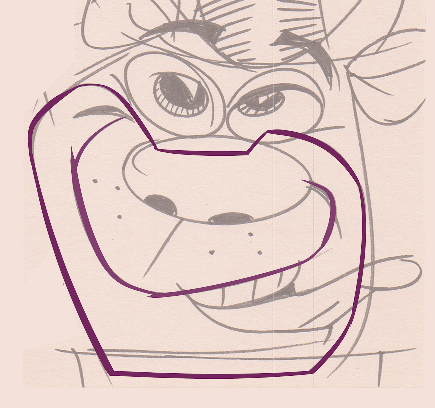
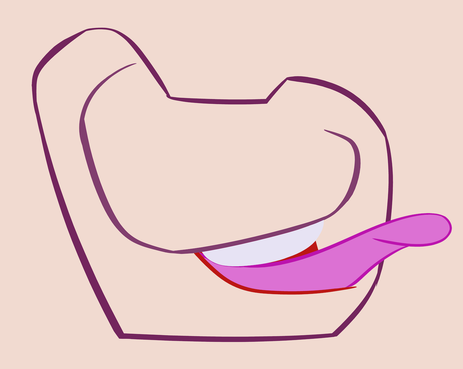
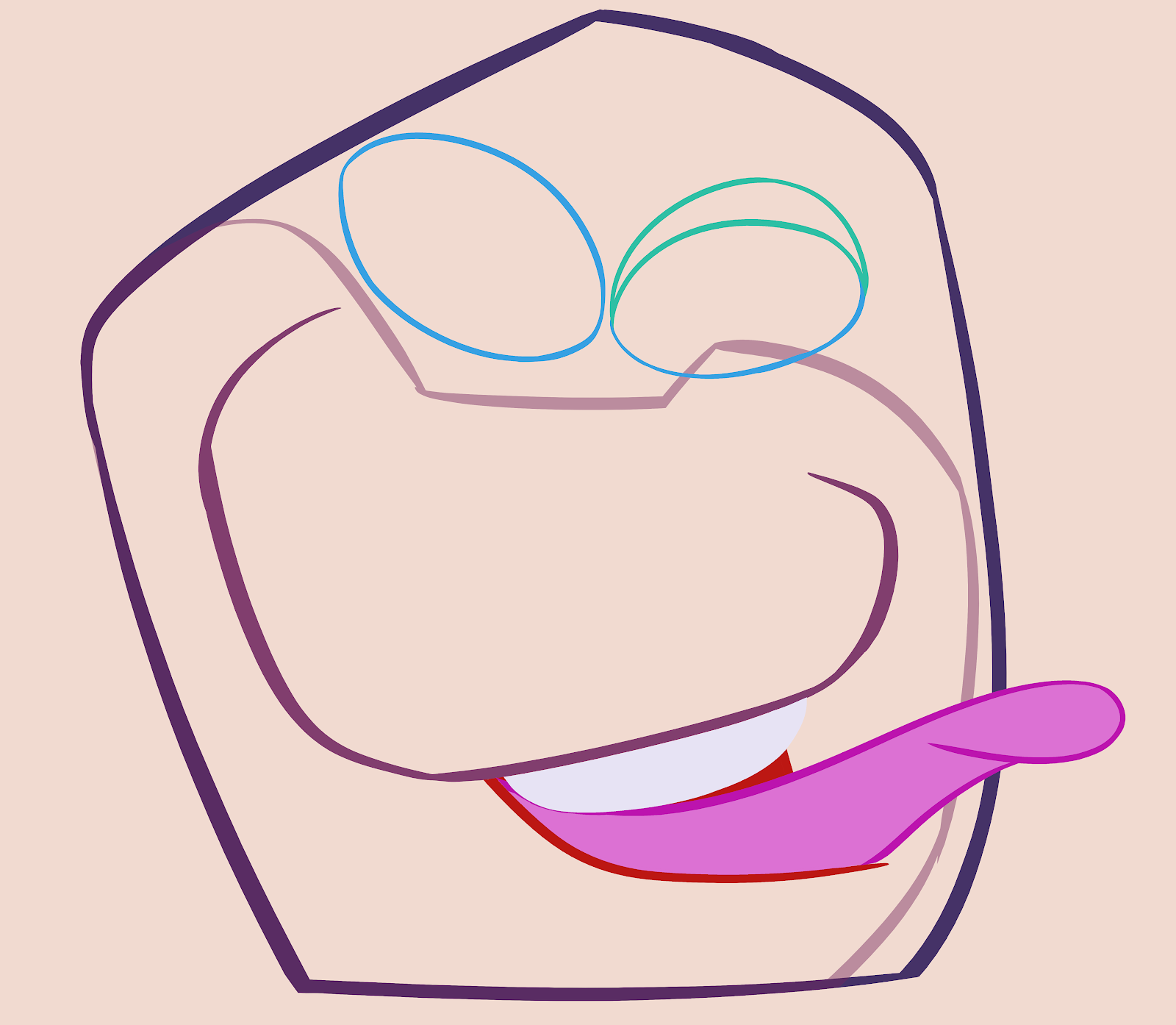
After the head I ink the next biggest shape which in this case is the bear's muzzle. I create a folder within the head folder and call it 'muzzle'. A layer inside is also called 'muzzle'. Every shape will get its own folder which keeps all the layers in an easy to understand hierarchy.
The next biggest shape is the mouth area so I ink that next. (I work my way down from the biggest shapes to the smallest shapes.)
BTW, I don't get a perfectly clean inking in one step. I ink each shape slightly rough and then clean it up after.
You can see that it took 4 strokes to get the shape of the muzzle. Each stroke is on a separate layer. Then I clean up where the strokes overlap to get a smooth shape. In order to do this neatly I clean one stroke at a time by turning the layer transparent so I can see where the lines overlap. I erase the overlap and then make the line opaque again and turn the next layer transparent and repeat the process.
Once all the layers have been cleaned up I merge them together to make just one layer.
You'll notice that this shape is not completely enclosed. I use the paint bucket to fill the shapes with color once I'm ready to color the whole drawing but I can't fill a shape with a color if it isn't completely
enclosed.So for this muzzle I will make another layer to complete the shape and call it 'connect'.
I don't want to see that line in the final painting which is why I keep it on another layer. Once I fill it with color I can turn off the enclosing line.
To fill a shape that is on 2 or more layers you have to select the shape by clicking the magic wand and also clicking the box that says 'sample all layers' at the top right.

...Or clicking the 3rd button at the top bar that appears on your window.
It depends on how your interface looks when you click 'W' for 'select'.
Then select the lines and the interior space.
Now that the whole shape is selected I can use the paint bucket to fill the shape with a color. I make a layer under the line layers and call it 'fill'.
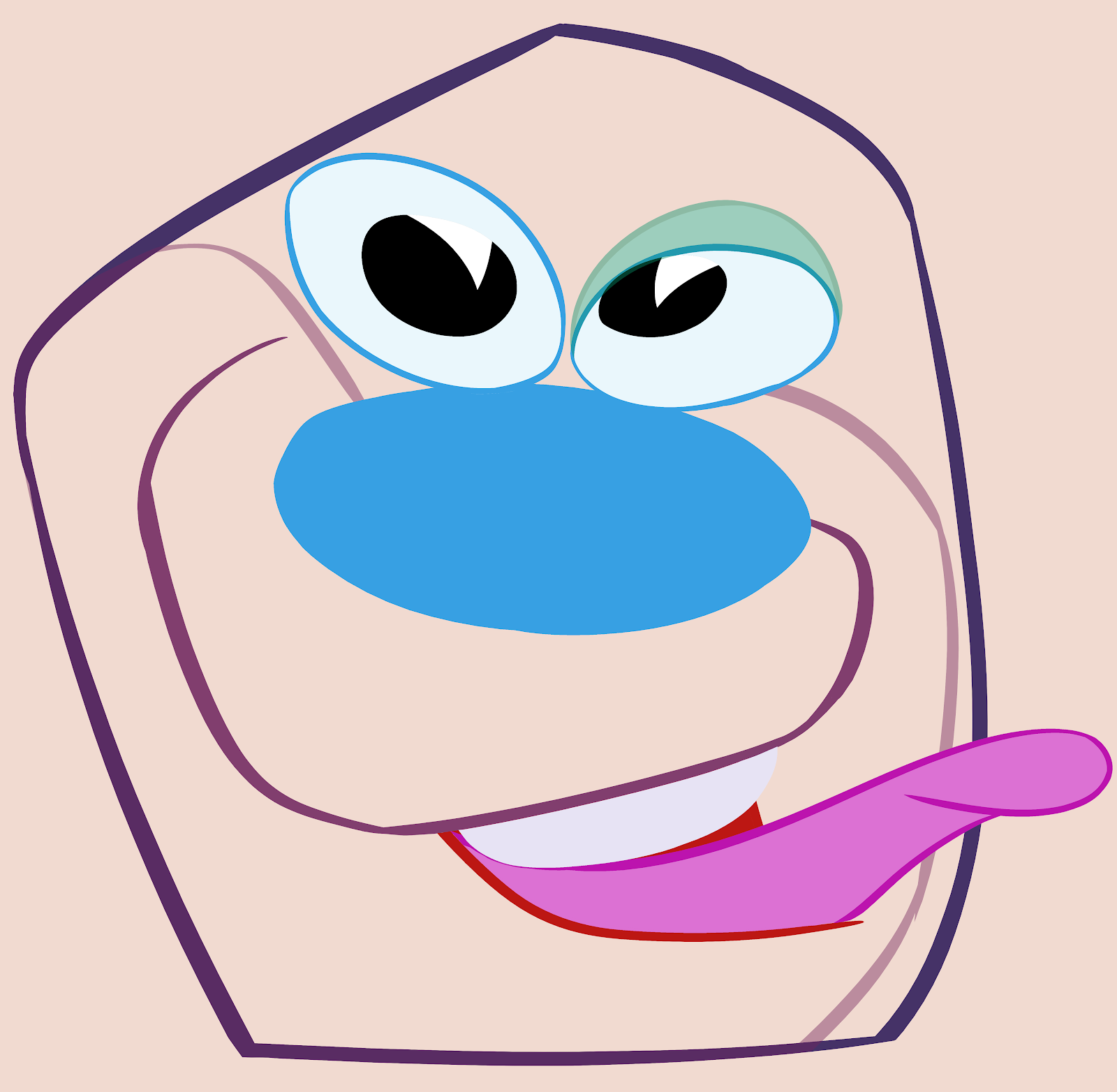
I use this same inking step by step approach to finish inking the whole head doing the biggest shapes first and working my way down to the smaller shapes.
Next post: Filling the lines with colors.
If you'd like to see more of the paintings I've done this way, you can check out my Inbred Kitties NFTs. Just click this little unfortunate guy here: