AMIR AVNI
Amir gets high points right away for how industrious he is. He is really taking the task of improving himself seriously. He doesn't just study one cartoon once. He is doing it every day it seems, and that will put him way ahead of the competition fast.
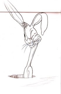
 This construction of Bugs Bunny seems overly complicated to me. Amir has added more construction lines than I did in the films. I don't know what some of them are for.
 But his final drawing is excellent and shows that he is getting the message.
All the details and features of the characters are wrapped around solid 3 dimensional forms.
He also has LEFT CLEAR SPACES BETWEEN AREAS OF DETAIL- very important.

He also checks his copies carefully and critiques them. Then he draws them again to try to correct any mistakes he finds. That's the way to improve fast.

Walter
 Walter's forms are a little too vague and soft. He needs to commit to the major shapes and then add stage 2, then stage 3. It kinda look like step 2 and 3 were done at the same time.
The details and wrinkles just seem to float inside the heads, instead of doing their jobs of helping to describe the features.
http://i186.photobucket.com/albums/x254/Waltezmo/comp.jpg
SOME OTHERS
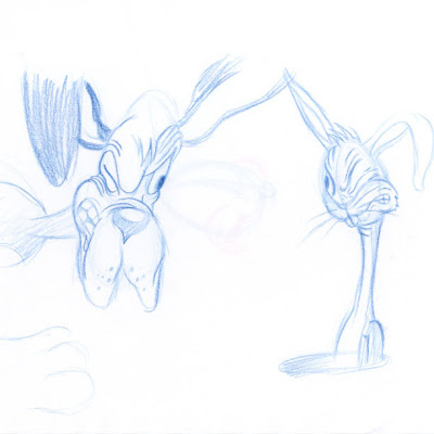
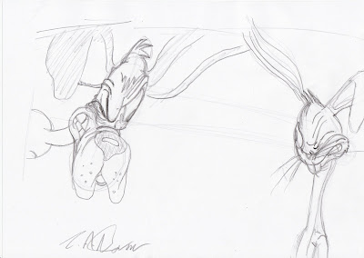
 This one has more commitment to the basic forms but the structure of the secondary forms is a bit wobbly. Nose is floating off to the left of the muzzle. The closed eye is not very solid. The lines around the eyes are floating around instead of describing a almond shape with a slit in the middle. The hair is not coming out of Bugs' head.
 This looks like step 1 - the basic forms was pretty good, but some of the final details are breaking up the shapes of the forms-especially on the left side of the head of the dog.
To Everyone*** wrinkles, lumps and folds should not stick out from the silhouettes of your drawing! Too many lumps eats up your forms. Smooth those wrinkles out...comb the wrinkles so they look related to each other
The top of Bugs' head doesn't make sense. The hairs are cutting holes in his head instead of growing out of a solid egg shape like they should.
WIGGLY STUDIES
 These look like the artists didn't do the drawings the way the instructions explained. They need to be much more careful and not so rushed.
 The proportions marked off from Bugs head don't match. It is very easy to measure the proportions but the artist didn't here. the neck is longer than the head here. should be same length as head
More...
 Not bad, but the top of Bugs' head isn't connected. The left side is higher than the right. The neck is too wiggly.
This one has a good feeling for solidity, structure and the details all wrap around the forms.
 Yikes! to both of these...much too scratchy and lumpy


